Exploring the Roots
There’s Gold in Them Thar Hills
Our research into the history of the CPC yielded a wealth of brand design and promotions we could use to enrich this chapter – and ultimately the national CPC’s entire image and marketing. We redeveloped the CPC logo to bring it back to its roots and convey its many years of service to the country.
Logo
![]()
In updating the CPC logo, we looked into their history, seeing how the logo had been changed over the decades. On the left are just two of the examples we found. On the right is the version that was being used when we came on board. We felt we could bring a feeling of heritage and depth to what had become an overly-distilled and generic logo.
Going right back to a classical depiction of Hermes/Mercury to make him less abstract, we reposed him and placed the torch in his hand. From there we turned him into an engraving like that of vintage postage stamps and currency. This gave him a feeling of permanence and expressed the decades of service the businesspeople that make up the CPC’s membership continue to provide to Canadians in need. The CPC title was reintroduced with both of the country’s official languages represented.
Event Branding and Booking
A number of events mark the CPC St Albert calendar each year. They’re a great way for members and the community to come together and enjoy a shared activity while raising money for local charities. We took the approach as we updated event branding to keep the CPC at the centre of an event’s identity. Sponsors may change, but it is the CPC that is the engine that keeps things going.
An event booking module was added to allow attendees to purchase tickets or book their teams for sporting events and other fundraising activities. Formerly utilizing a third-party event booking service, bringing this important function inhouse increased ease of us and the CPC’s credibility in the community.
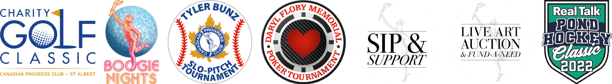
Charity Logos
![]()
CPC St Albert is directly connected to a number of organizations in their community, and we found that the logos for those charities were hard to work with when we were listing them on materials at varying sizes. So we provided some updates that worked better and they were well received. Top line are the originals. Bottom line are the updates.
Website
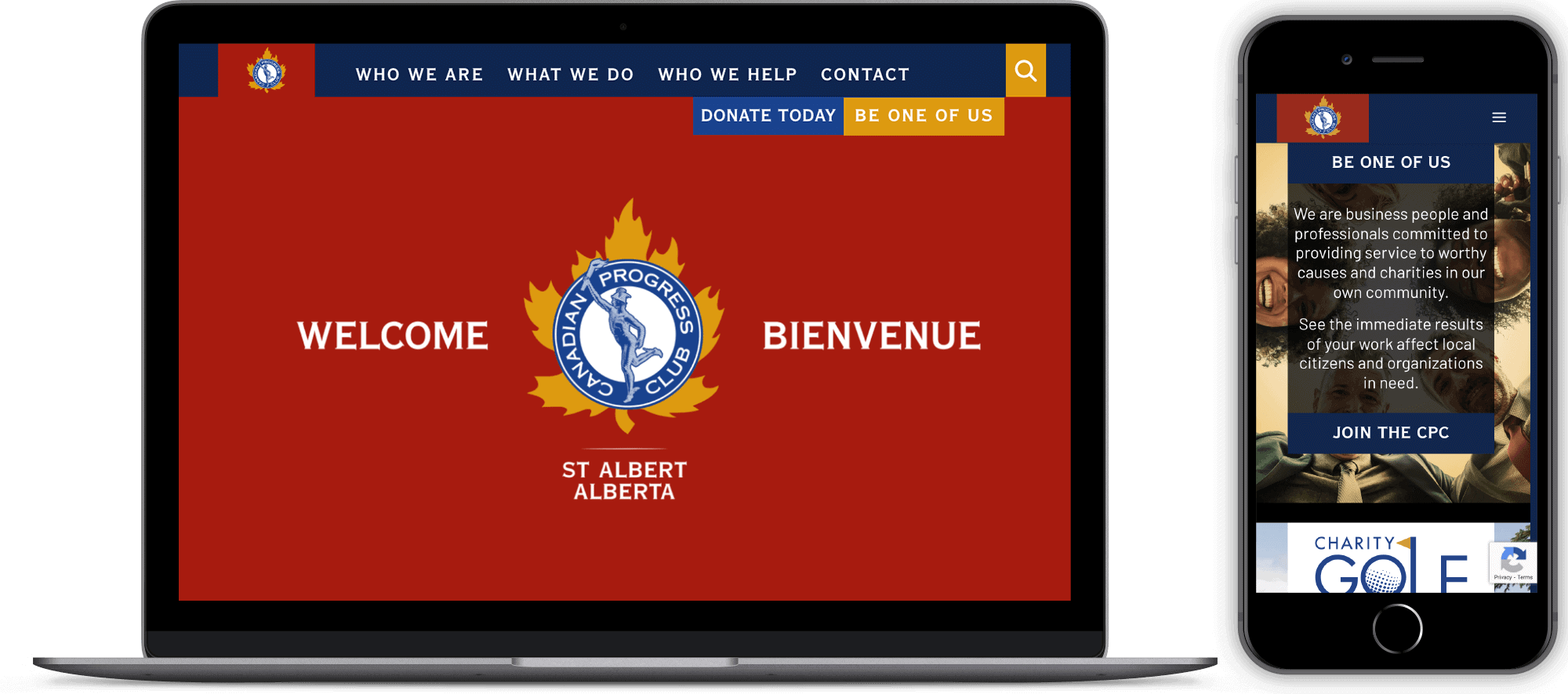
We re-made the St Albert site making it easy to navigate, and we showed with each activity that it was about a positive group of individual businesspeople coming together for friendship and good cause.